Cheers for the replys people

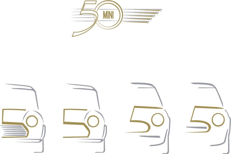
I know how you mean with the "MINI" text, however if you look at some of the origional mini badges , mini is written in a similar typeface using all capitals.
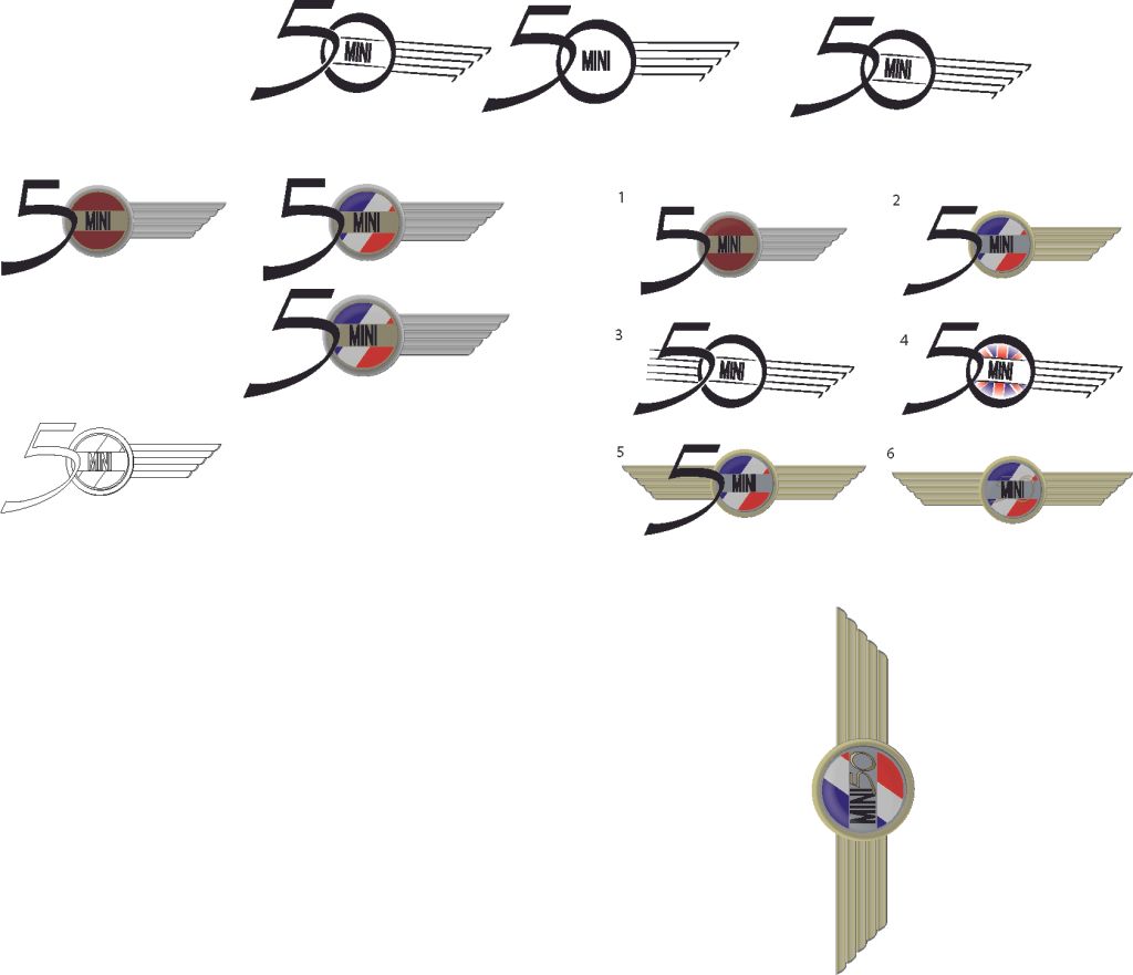
I think the 5 with the "0" using the gold badge didnt stand out enough to people who didnt know about the mini fifty, hence why i started using the more stylised approach.
I have got 2 pages of pencil drawings, Im just going to choose a fw of them to go into more detail on the computer and see where they lead. (this being the first one)
That way ill end up with 3 final logos to choose from.
Looking at the typeface ive used for the 50, i dont think it qute suits the logo on the black and white ones, origionaly the 5 was supposed to look like it had been drawn in marker ontop of the winged logo. However with the stylised one i guess theres no reason for a sketchy looking "5"
However i think the font for the "MINI" is nice and retro, and shows the start of the mini, and the wings show the cooper / rover "last mini" kinda things, and the fact theres 5 wings show 50 years.
Looking at the flag one it looks a little too cheap, + forced? doesnt flow they way id expect a logo to.(if that makes sense?)
But yeah looking at all the logo designs ive posted, they look very ammature in a smaller size... another page of development
Cheers for the Advice people