The font used for the lettering is "Forelle", and the accent beneath is is a modified "Marcelle Swatch":
http://www.dafont.com/forelle.fonthttp://www.dafont.com/marcelle.font Dafont has a ton of downloadable .TTF and Mac fonts, all of which are free for personal use.
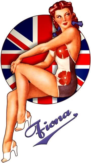
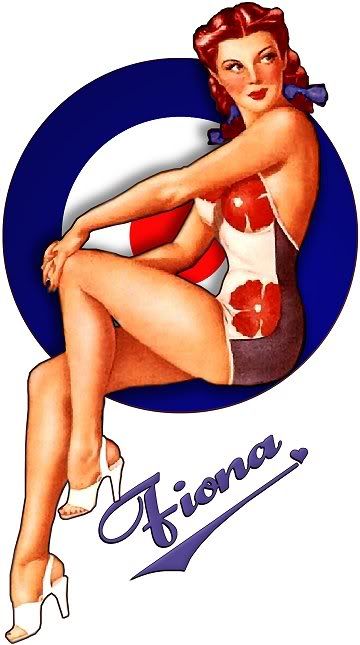
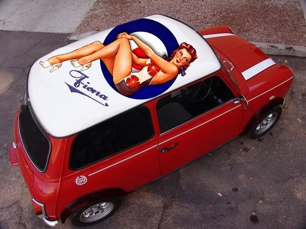
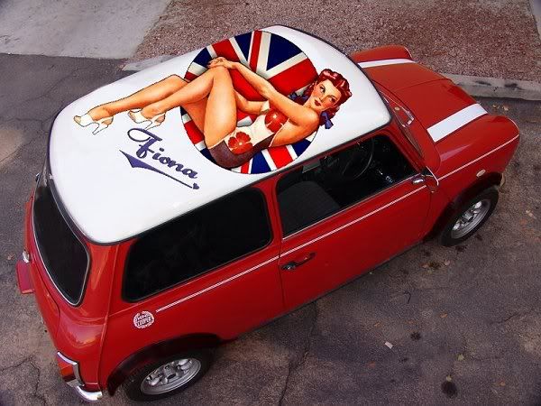
I built the graphic myself using Paint Shop Pro 7 (yes I know it's old, but I know the app and it still does a good job... plus I can't afford Photoshop). The original image was very small, so I resized it to 600% using Genuine Fractals, a plugin for Photoshop (which also works in Paint Shop). The extreme upsizing caused the image to "stipple" and create an effect sort of like stained glass, which I modified with Softening tools and some other tricks I've picked up over the years....
I wanted "Fiona" to be a redhead (of course) so I tinted her hair red and changed the color of her hair bows to blue (the original had brown hair and red bows).
I'm in Ohio, USA, yes...

Edited by ImagoX, 07 August 2007 - 04:02 PM.